
- Training
- Service
- Promotion
- Schedule
- Testing Center
- News
- Contact
8/25/2020


Charts are one of the most important parts of Microsoft Excel. It helps us to present our data understandably. In Excel, we have different kinds of charts and graphs to present our data in different ways.
Even there are a lot of advanced charts and graphs which we can create in Excel by making small amendments in default charts. Now the bad news is, most of the Excel users don’t explore charting techniques much. But you can learn to create all those charts with little extra effort.
The benefit of using advanced charts in Excel is they are focused on a specific kind of data and make it more understandable. Today in this post, I have a list of Top 10 Advanced Excel Charts and Graphs, just for you.
An Advanced Excel Chart or a Graph is a chart that has a specific use or present data in a specific way for use. In Excel, an advanced chart can be created by using the basic charts which are already there in Excel, can be done from scratch, or using pre-made templates and add-ins.
Below is the list of top advanced charts and graphs which are covered in this guide.
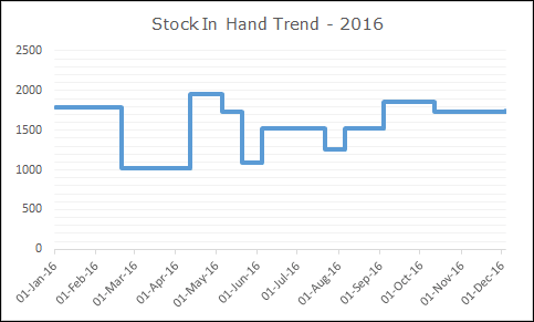
A step chart is an extended version of a line chart. It’s is perfect to use when you want to show the changes happened at irregular intervals.
Unlike the line chart, it doesn’t connect data points using a short distance line. It uses vertical and horizontal lines to connect the data points.
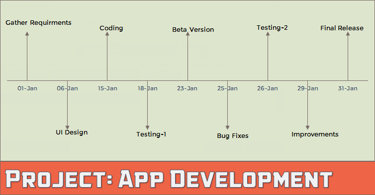
Milestone chart also knows as a timeline chart. It’s one of the favorite charts of project managers and helps them to track their project’s progress simply.
It’s just like a time in which each stage of the project is captured with the date of completion.
Milestones are tools used in project management to mark specific points along a project timeline. These points may signal anchors such as a project start and end date, a need for external review or input and budget checks, among others. - Wikipedia
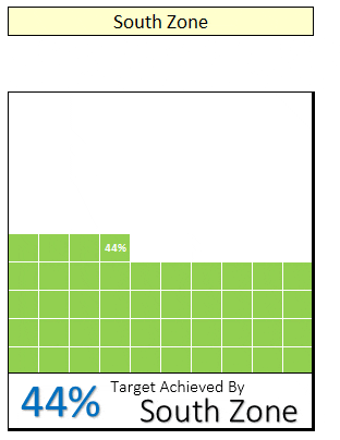
A waffle chart is more likely a square pie chart. It’s a bunch of 100 small squares where one square represents the 1% of the total value.
I’m sure you have seen it in dashboards and news article graphics. And, to create it we need to use conditional formatting.
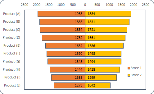
When it comes to showing the comparison of different things with each other tornado chart can be useful for you.
It looks like a real tornado where large items are on the top and lowest at the bottom. And, each item has an opposite item for comparison.
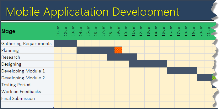
Gantt chart is one the most useful chart for project managers. It can help us to track the project’s progress. Unlike a milestone chart, a Gantt chart can track completion days, delayed days, days pending, totals days, etc.
In short, it’s a complete chart to track your projects with all the important details which everyone requires.
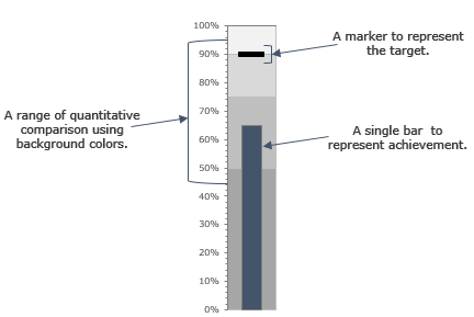
A bullet chart is just like a column chart but instead of multiple columns here we have only one. It can help us to track a single point target vs. achievement.
There are three major components of a bullet chart:
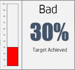
A thermometer chart is another useful chart to track a single point target vs. achievement and can help us to present our data understandably.
It looks like a thermometer where the entire chart presents the target and filled part is the achievement. The filled part goes up as the achievement increase.
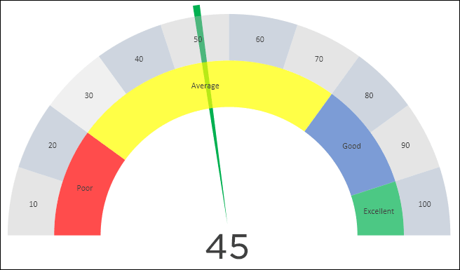
It’s a kind of thing which you can find in your day to day life [Just look at the SPEEDOMETER in your car]. It's also known as a Gauge chart.
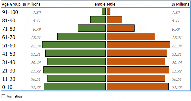
A population chart is a two-sided bar chart that helps us to compare the population of different age groups of genders.
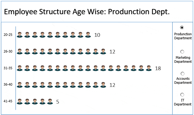
A pictograph is not a separate kind of chart.
By creating a pictograph we can use an image in a chart to make it more presentable. Just like we have used an icon in the below chart to present the number of employees in a company in different age groups.
Source: excelchamps.com

12/11/2025


