
- Training
- Service
- Promotion
- Schedule
- Testing Center
- News
- Contact
8/14/2019


An Effective Use of Pie?
See the following pie chart. The graph shows the results of a survey based on the question, "How long did it take you to decide to meet" first love "?
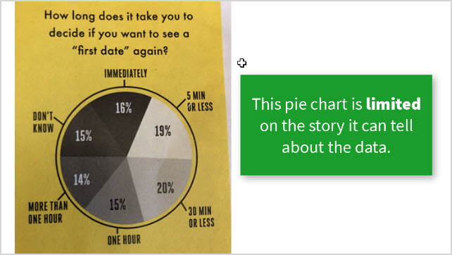
What insights can you immediately gain about this data?
Charts Are All About Story
The goal of graph is to convey the content of the data. And from that, make a decision. So what decision do you make with the pie chart?
The job of the chart creator is to convey the content in a quick, neat way for viewers to understand. These are the basic principles of graphic data (also known as charting).
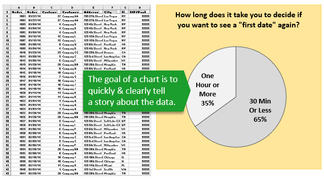
If a chart is difficult to understand and doesn't present a clear story, then our brains have to do extra work to read it. This is not only time consuming, but can leave the reader confused or frustrated.
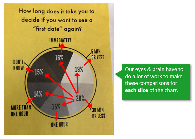
In the case of this chart, our eyes will have to work a lot to compare each section to determine what is the most occupied part, and how the results are comparable to the other. .
If you create charts that confuse readers, you will have to open Excel and PowerPoint files around to explain the chart to everyone.
The only story this pie chart can effectively tell us about the data is that all of the slices (categories) performed about the same.
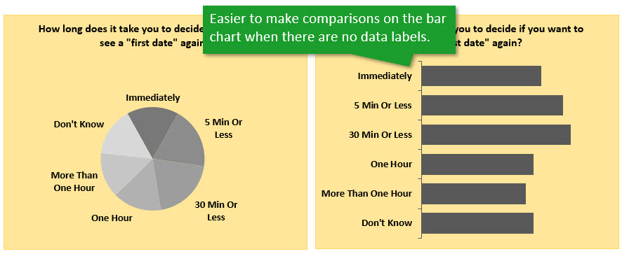
If we remove the value labels, it's nearly impossible to compare and order the sizes of each slice.
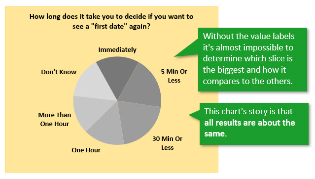
If we do want to make comparisons between slices, then we are forced to reorganize the data in our brain. So, let's see how we can do this for the reader.
Bar Chart – An Alternative to Pie
One common alternative to a pie chart is a bar chart. Here is the same data presented in a bar chart.
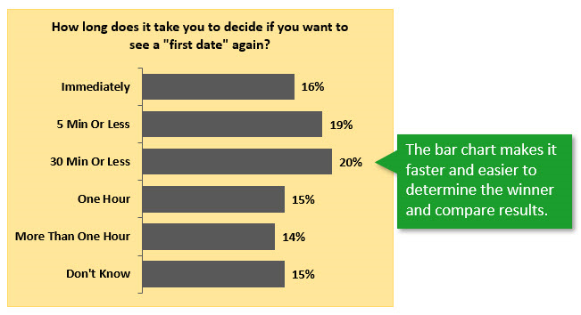
I know it might not be as fun or exciting to look at, but it's easier to read.
The bar chart allows us to quickly determine the winner (the longest bar), and also compare the length of each bar.
One way to really emphasize this point is by removing the data labels. What conclusions can we make about the data now?
Change the Story by Sorting
Another advantage of the bar chart is that we can quickly change the story by sorting the data.
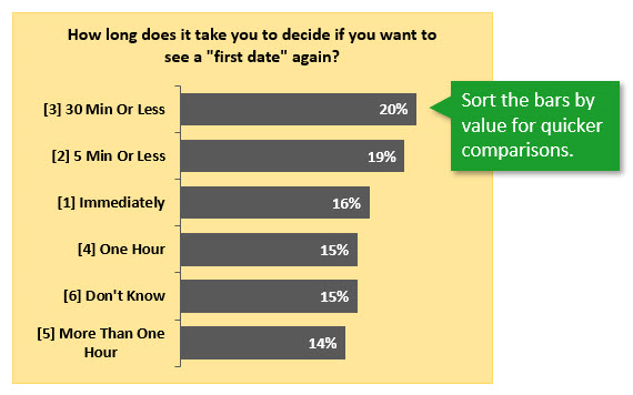
For the example above I sorted the values column in descending order (largest to smallest). This gives us a different view of the data and allows us to make quicker comparisons on performance.
A Few Cases for Pie
Bar charts are not applicable for most reports. We just need to make sure that the pie chart can convey the content of the data. See the example below:
A case of a circular chart is when there is a value superior to the rest. 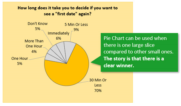
In this case, the biggest part will attract us, and other smaller parts will be less prominent.
Grouping the Data into Fewer Slices
Another option is to group the data into fewer slices. Since the categories are based on time, we can group them to display different results.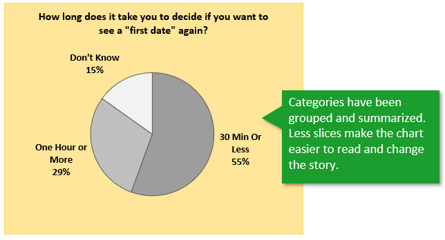
Now we can quickly see more than half of the answers that make the decision to date for 30 minutes or less.
If we delete the "Don Not Know" section, we get an even clearer picture of grouped data.
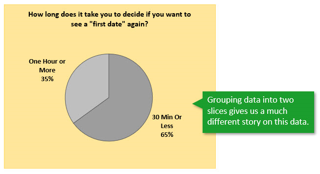
Nguồn: Excel Campus

12/11/2025


