
- Training
- Service
- Promotion
- Schedule
- Testing Center
- News
- Contact
5/7/2024


Power BI is a great business intelligence tool that offers many interactive visualizations. One essential visualization that every Power BI user should learn and master is the Power BI matrix, which enables users to organize and analyze information in a structured and intuitive way.
In this tutorial, we will learn all about the Power BI matrix, including how to create and customize our matrix using advanced features. Mastering the tool will empower us to make data-driven decisions and create compelling, insightful reports. Let’s dive in!
What is a Power BI Matrix?
In Power BI, a matrix refers to a specific type of visualization that displays data in a grid format. However, the Power BI matrix is more than a simple table. The matrix is notable because it also brings advanced capabilities that allow for data analysis across additional dimensions and metrics. Let’s explore the key features in detail to see how all this works.
Matrix vs Other Kinds of Tables
You may be aware of other kinds of tables if you have worked with products in the Microsoft ecosystem.
The Power BI matrix distinguishes itself from other kinds of tables like the Power BI table and the Excel pivot table. While the pivot table is adept at handling detailed data manipulations within Excel, it lacks the seamless integration with real-time data updates and data sources that Power BI offers. On the other hand, although the Power BI table exists in Power BI, it does not have features like expandable rows and columns.
Let’s document the differences in a table of our own.
|
Feature |
Power BI Matrix |
Power BI Table | Excel Pivot Table | |||||
| Data organization |
Rows, columns, and values |
Rows and columns | Rows, columns, and values | |||||
| Dimensionality |
More than two dimensions |
Two dimensions | More than two dimensions | |||||
| Aggregations |
Multi-level aggregations |
Basic totals | Multi-level aggregations | |||||
| Drill down |
Full drill down and drill through |
Limited drill down | Full drill down and drill through | |||||
| Conditional formatting |
Supported |
Supported | Supported | |||||
| Hierarchies |
Supports hierarchies |
No hierarchies | Supports hierarchies | |||||
| Complexity |
Suitable for complex analysis |
Straightforward, detailed views | Suitable for complex analysis | |||||
| Visual impact |
Simple or complex, depending |
Clear and simple presentation | Simple or complex, depending | |||||
| Data source integration |
Direct integration with data sources |
Direct integration with data sources | Works mainly with Excel | |||||
| Real-time data |
Supports real-time updates |
Supports real-time updates | Not designed for real-time updates |
When to Use a Power BI Matrix
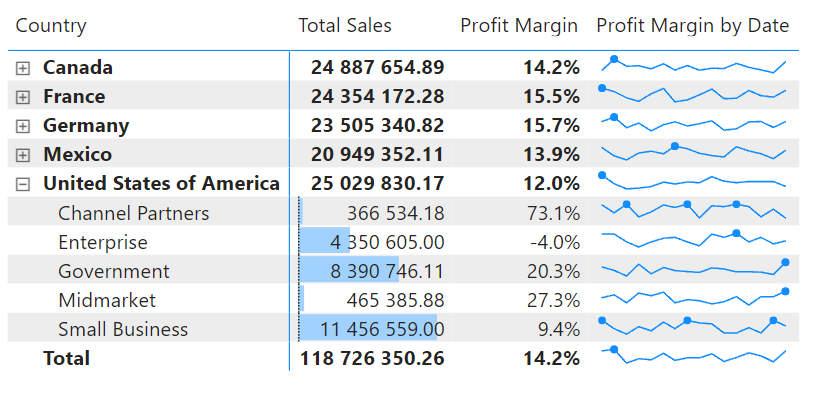
Comparative analysis
The first point is that a matrix is suitable for comparative analysis. The grid format of a matrix allows us to see how different groups compare, correlate, or how they might vary.
In the example, we see that Profit Margin is highest in Germany and lowest in the United States.
Multiple dimensions
A matrix is also a great option if our analysis involves two or more dimensions. In effect, we use a matrix to find a way to include even more information.
In our example, we consider the Profit Margin for different countries over time, which is three dimensions in a single cell.
Hierarchies
A matrix is a great option if the relationships in our dataset take a nested structure. The matrix is perfect for data with natural hierarchies because it allows users to expand and collapse levels without losing the overall context.
In our example, the United States contained several levels, such as Channel Partners and Enterprise. Importantly, we are confident that the values for our subcategories add up to the total in the top level.
Need for subtotals and grand totals
A matrix is a good choice when we want to keep the total values for categories and subcategories in mind. The Power Bi matrix even dynamically recalculates numbers when we use features to drill down and filter.
In our example, we see a Total row at the bottom, which provides a good reference point as we compare categories.
Cross-highlighting with other visuals
A matrix is a good choice in reports where multiple visuals need to interact. Selecting elements within a matrix will automatically highlight or filter related data in other charts, making the report more interactive.
5 Common Pitfalls and How to Avoid Them
1. Overloading data
Crowding too many rows, columns, and values into a single matrix can make it challenging to interpret. Focus on key metrics and dimensions. Utilize drill down features to allow users to explore data levels without initial overload. Consider using slicers or filters to manage how much data is shown in one view.
2. Poor performance with large datasets
Matrices can become slow and unresponsive when handling large datasets due to excessive calculations and rendering. Optimize your data model by reducing the number of unnecessary columns and rows. Do some housekeeping to eliminate calculations you aren’t using in your final product.
3. Ineffective use of conditional formatting
Use conditional formatting judiciously. Choose color schemes that are easy on the eyes and logically enhance the data’s readability. Focus on highlighting key data points or trends, and avoid using too many colors or rules.
4. Complex hierarchies
Maintain a simple hierarchy where possible. Start with a collapsed view and allow users to expand for more details. Clearly label each level of the hierarchy to make it easier for navigation.
5. Ignoring mobile users
If you have mobile users, design your reports with mobile in mind. Test how your matrix looks and behaves on different devices. Use features like responsive layout design in Power BI to ensure that matrices are legible on mobile devices.
Conclusion
The Power BI matrix is an incredible tool for effectively organizing and analyzing data. And with a bit of consistent practice, the Power BI matrix will significantly enhance your ability to create impactful reports. Use features like conditional formatting, drill through, sparklines, and data bars to transform your matrix into something especially dynamic and interesting.
Source: datacamp.com

12/11/2025


